This tutorial was created by Aurora Tsai for students/researchers working with education data (e.g., second language acquisition).
GGplot2 is a package for R created by Hadley Wickham. It helps you make beautiful, easy-to-read visualizations of your data. In this tutorial, I cover the following:
Scatter Plots: R base graphics vs. ggplot
Calculating Confidence Intervals
Bar plots
Box plots
Line graphs
Using Color Palettes
Study time and Test score Data
Pretend you've conducted an experiment where 20 students took tests A and 20 took test B. You recorded how many hours they studied for the test and calculated the score.
Create a dataframe called "d" and have it include the following:
40 participants.
The first 20 participants studied 0 - 10 hours and second 20 participants who studied 3 - 15 hours.
The first 20 participants happen to be in condition "A" and the second 20 in condition "B"
The first 20 participants score between 80 - 100 on the test, while the second 20 score between 100 and 120.
part <- rep(1:40)
stime <- stime <- c(runif(20, min = 0, max = 10), runif(20, min = 3, max = 15))
condition <- c(rep("A", times = 20), rep("B", times = 20))
score <- c(runif(20, min = 80, max = 100), runif(20, min = 100, max = 120))
d <- data.frame(part, stime, condition, score)
head(d)

  part study.time condition    score
1    1   4.513558         A 92.08190
2    2   4.715490         A 87.73928
3    3   2.075067         A 98.46060
4    4   8.561459         A 90.67973
5    5   3.330650         A 93.66268
6    6   2.048237         A 92.73496
Scatter Plots
You want to visualize how study time influences score AND you want to visualize the differences between condition A and B. How can we do this with base R graphics? With ggplot? Let's compare.
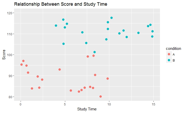
Here is a plot created with R's base graphics:
plot(d$stime, d$score,
       xlab = "Study Time",
       ylab = "Score",
       main = "Relationship Between Score and Study Time",
       ylim = c(80,120),
       xlim = c(0, 15),
       lwd = 5,           #set thickness of point
       col = d$condition) #set color based on condition
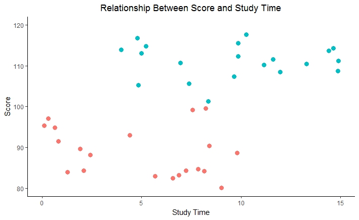
Here is one created with ggplot:
scatter <-  ggplot(d, aes(x=stime, y=score, color = condition)) +
      geom_point(size = 3) +
      ggtitle("Relationship Between Score and Study Time") +
      ylab("Score") +
      xlab("Study Time") +
      ylim(80,120) +
      xlim(0,15)
  scatter
GGplot uses the aes or "aesthetic" to indicate what variables to map onto the plot. Then you can add layers using + (component). For example, geom_point() is used for a scatter plot, while geom_boxplot() is used for a boxplot, geom_line is used for a line plot and so on. You can also use multiple components (e.g., geom_line() + geom_point() connects points with lines). You can add layers all at once or incrementally.
For example, we might want to add a few more layers to our scatter plot:
scatter <- scatter +
    theme_classic() +                               #Use a premade theme with a white background
    theme(plot.title = element_text(hjust = 0.5)) + #Center the title
    theme(legend.position = "none")                 #turn off automatic legend
scatter
The graphs in this example are pretty similar. So then, why use ggplot?
One advantage is that its easy to make a large variety of visualizations with the same data set, and you can do so by changing what layers you're adding. In addition, ggplot allows you to add many features to your plot that would be cumbersome with base R graphics (e.g., confidence intervals, residual plots). For a list of other advantages, see Mandy Mejia's blog.
Calculating Confidence Intervals
If we want to include confidence intervals in our barplots or line graphs, we need to calculate them first. In order to calculate confidence intervals (CI), we need to calculate our CI multiplier.
ciMult <- qt(conf.interval/2 + .5, N-1)
The qt() function calculates our t-distribution. In this case, we will use a 95% confidence interval and 39 degrees of freedom (N-1).
ciMult <- qt(0.95/2 + .5, 40-1)
Aggregate the Data
We can then use the summarise() function in dplyr to aggregate means and our confidence intervals into a dataframe. (Your numbers will look slightly different because of the randomly generated dataset)
library(dplyr)
dsum <- summarise(group_by(d, condition), m=mean(score),
               sd=sd(score), se=sd/sqrt(40), ci= se*ciMult)

head(dsum)
  condition         m       sd       se       ci
     (fctr)     (dbl)    (dbl)    (dbl)    (dbl)
1         A  90.79179 5.712633 1.277384 2.673595
2         B 110.07836 6.071723 1.357679 2.841654
Option 2 (Easier)
Another way to calculate the CI intervals is by using the summarySE() function in the "Rmisc" package.
library(Rmisc)
    dsum <- summarySE(data=d, measurevar="score", groupvars="condition")

dsum
#  condition  N     score       sd        se       ci
#1         A 40  90.79179 5.712633 1.277384 2.673595
#2         B 40 110.07836 6.071723 1.357679 2.841654
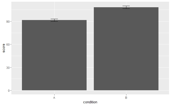
Bar plots
Once you have the confidence interval and mean scores, you can create a basic bar plot using ggplot2.
library(ggplot2)

ggplot(dsum, aes(x=condition, y=score)) +
      geom_bar(stat="identity")  +    #we use 'stat="identity"' so that ggplot knows to use the exact values from the dsum dataframe
      geom_errorbar(aes(ymin=score-ci, ymax=score+ci), width = .1)
Why is this bar plot hard to read? How can we change it to be "prettier"?
With ggplot, you can keep adding on bits of code to adjust how the bar plot looks. Here are some basic add-ons that are useful for SLA visualizations:
pretty.bar <- ggplot(dsum, aes(x=condition, y=score)) +
      geom_bar(aes(fill=condition),                #fill the color of the bars based on the condition
               stat="identity", width = .5) +      #change the width of the bars
      geom_errorbar(aes(ymin=score-ci,
          ymax=score+ci), width = .1) +            #change the width of the error bars
      ggtitle("Mean Score for Conditions A & B") + #add a title
      ylim(0, 125) +                               #set the y-axis range
      ylab("Mean Score") +                         #Y-axis label
      xlab("Condition") +                          #X-axis label
      theme_bw() +                                 #change the theme to black and white
      scale_fill_brewer(palette="Set1") +          #add a color palette
      theme(plot.title = element_text(hjust = 0.5))#center the title

pretty.bar
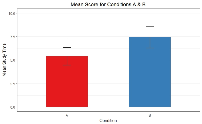
Try it
Now that you've seen how to make barplots using the score data, try visualizing the mean study times for condition A and B. Make sure you get the CIs first.
t <- summarySE(d, measurevar="stime", groupvars="condition")

    stime.bar <- ggplot(t, aes(x=condition, y=stime)) +
      geom_bar(aes(fill=condition),
               stat="identity", width = .5) +
      geom_errorbar(aes(ymin=stime-ci, ymax=stime+ci), width = .1) +
      ylim(0,10) +
      ggtitle("Mean Score for Conditions A & B") +
      ylab("Mean Study Time") +
      xlab("Condition") +
      theme_bw() + #change the theme to black and white
      scale_fill_brewer(palette="Set1") +
      theme(plot.title = element_text(hjust = 0.5)) +
      theme(legend.position = "none")                 #turn off automatic legend
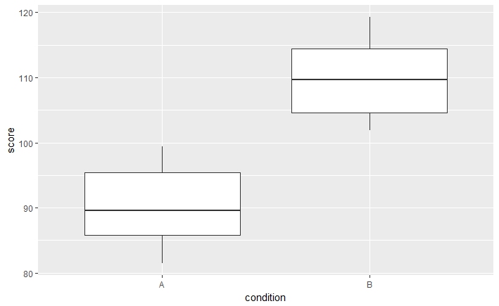
Box Plots
Once you've learned how to do bar plots, box plots are pretty straight forward.
We simply use geom_boxplot() instead of geom_bar(). We also use the orginal data from our d dataframe instead of the aggregated means from the dsum dataframe.
Prettify the boxplot by adding a title, x and y-axis titles, colors, and a white background. Hint: the process is very similar to modifying bar plots.
pretty.box <- ggplot(d, aes(x=condition, y=score)) +
      geom_boxplot(aes(fill=condition)) +             #make a boxplot
      ggtitle("Mean Score for Conditions A & B") +
      ylab("Mean Score") + #Y-axis label
      xlab("Condition") + #X-axis label
      theme_bw() + #change the theme to black and white
      scale_fill_brewer(palette="Set1") +
      theme(plot.title = element_text(hjust = 0.5)) +
      theme(legend.position = "none") +
      geom_point(position = "jitter")                 #adds points and offsets them by setting the position to "jitter"
pretty.box
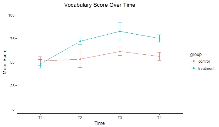
Line Graphs
Sometimes we want to use line graphs to visualize our data (e.g., to show changes between groups over time). Lets use the following data set (copy this code into your script):
longstudy <- data.frame(part = 1:50,
    group = c(rep('control', times = 25), rep('treatment', times=25)),
    L1 = sample(c("Eng", "Chi"), 25, replace = T, prob =   c(0.5, 0.5)),
    T1 = as.integer(rnorm(50, 50, 10)),
    T2 = c(as.integer(rnorm(25, 55, 20)), as.integer(rnorm(25, 70, 10))),
    T3 = c(as.integer(rnorm(25, 65, 10)), as.integer(rnorm(25, 85, 20))),
    T4 = c(as.integer(rnorm(25, 60, 10)), as.integer(rnorm(25, 75, 10))))

head(longstudy)

  part   group  L1 T1  T2 T3 T4
1    1 control Eng 35  49 67 51
2    2 control Chi 42  54 70 71
3    3 control Chi 50  18 71 46
4    4 control Chi 47   7 69 63
5    5 control Chi 47  16 69 48
6    6 control Chi 58 102 43 40
ggplot provides the geom_line() function to make a line graph:
library(tidyr)
long.longstudy <- gather(longstudy, time, score, -part, -group, -L1)
2) Aggregate the data for mean scores and CIs. We also want to compare the treatment group with the control group over time, so we add the "group" variable to the groupvars in summarySE.
l <- summarySE(long.longstudy, measurevar="score", groupvars= c("group", "time"))
Now we can try making a simple line graph.
ggplot(l, aes(x=time, y=score, group = group)) + geom_line()
Try this
On your own, add CIs, a title, axis labels, adjust the y-axis range, and modify the colors of the line graph. You may adjust other elements based on your preference.
pretty.l <- ggplot(l, aes(x=time, y=score, group = group, colour=group)) +
      geom_line() +
      geom_errorbar(aes(ymin=score-ci, ymax=score+ci), width = .1) +
      ylim(0,100) +
      ggtitle("Vocabulary Scores Over Time") +
      ylab("Mean Score") +
      xlab("Time") +
      theme_classic() + #change the theme to black and white
      scale_fill_brewer(palette="Set1") +
      theme(plot.title = element_text(hjust = 0.5)) +
      geom_point()

pretty.l
Color Palettes
If you want to change up your color palettes, you have several options.
RColorBrewer::display.brewer.all() #displays built-in color palettes in R

#same as

library(RColorBrewer)
display.brewer.all()
To use one of the built-in color palettes, just replace "Set1" in the scale_fill_brewer(palette="Set1") for the line graphs with another palette (e.g., "Dark2" or "Paired").
If you'd like to create your own color palette, you can do this too by creating a vector of colors. The one below uses html color codes that are colorblind accessible:
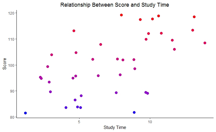
One last neat visualization with color is using a gradient. This works well with scatter plots.
scatter <- ggplot(d, aes(x=stime, y=score, color=score)) +
      geom_point(size = 3) + #change the size of the points
      ggtitle("Relationship Between Score and Study Time") +
      ylab("Score") +
      xlab("Study Time") +
      theme_classic() +
      scale_color_gradient(low = "blue", high = "red") + #Add a color gradient
      theme(plot.title = element_text(hjust = 0.5)) +
      theme(legend.position = "none")
scatter
This has only been a brief introduction to the visualizations you can make with ggplot2. There are many other tutorials available on the web that go into depth about ways you can customize your plots, visualize multiple aspects of your data at once, and much more. Once you've learned the basics, it will be easy to explore and learn about these on your own:)